
Winter 2019 - Summer 2020

Springboard Capstone project
Thrive, iOS app concept
Context
The below concept is something I wish existed for health-conscious individuals. Experiences heard from family, friends and coworkers, as well as my own, of (1) reviewing products to ensure they’re free from allergens and harmful ingredients and (2) tracking reactions after consumption provided me the opportunity to conceptualize an iOS app focusing on these two aspects.
The problem
Thrive targets users with a specific diet preference(s), food allergen(s) or who have an interest in health. Developing an app that provides a swift process for users to record any reaction after consumption and delivers thorough nutritional feedback of products were the biggest design challenges to tackle.
My role
User research
Personas and empathy maps
Competitive analysis
User flows, wireflows and user stories
Low-fidelity and high-fidelity design
Prototyping
Guerilla testing
Usability testing
Evaluation
Deliverable
Styleguide, Lo-fi and Hi-fi prototypes, iOS Mockup
Outcome
Thrive is an iOS health app that course-corrects users’ eating habits and educates users on how the food they eat impacts their health.
Capstone process
Research
User survey + initial user interviews
Heuristic analysis of competitors
HMWs
Synthesize
Themes + insights
Affinity map
Personas
Design + key learnings
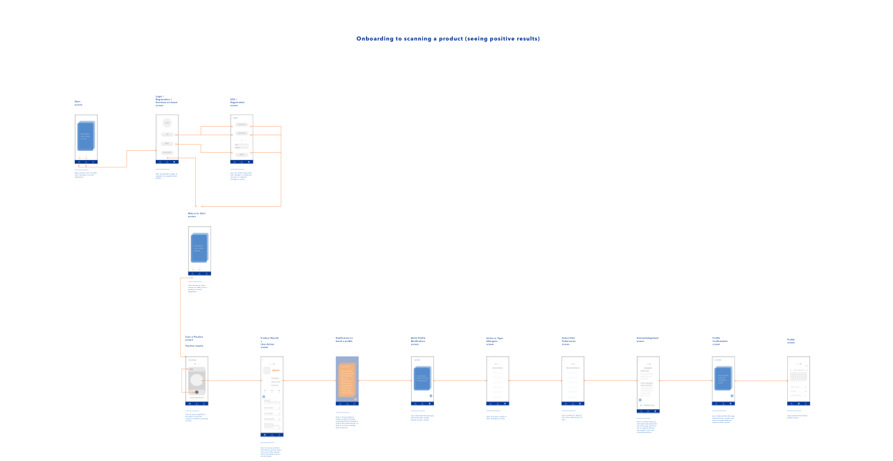
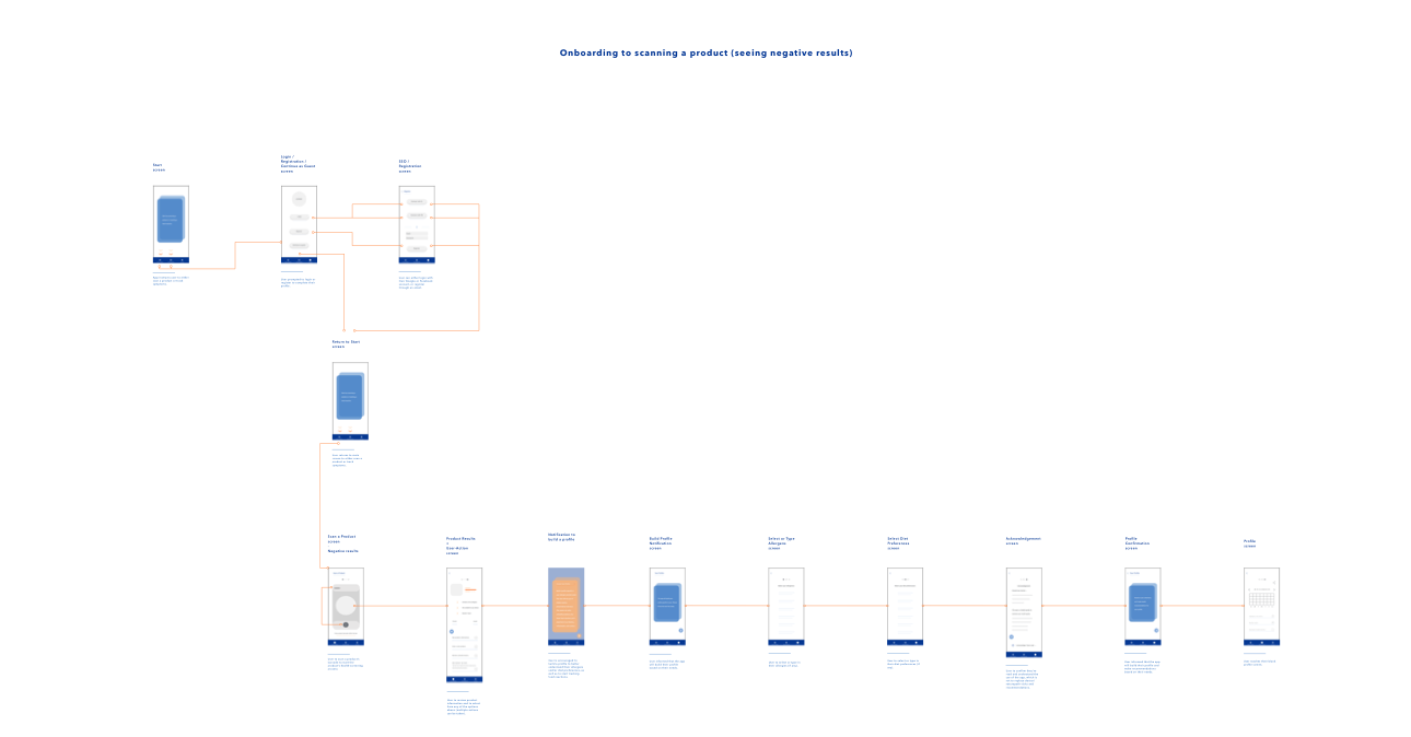
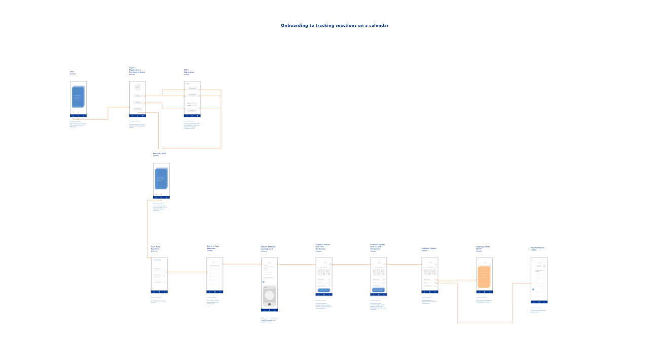
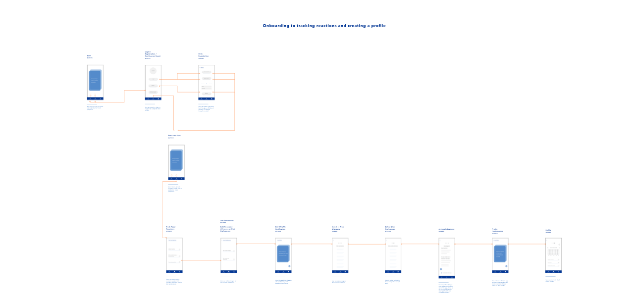
User flows
Wireflows
Key learnings
Initial sketches
Lo-fi wireframes
Styleguide
Hi-fi wireframes
Prototype
Usability testing
The solution
Conclusion
Next steps
Reflections
Research
User survey
A survey was distributed to 5 participants, between 29 - 59 years of age, who either have a specific diet preference, food allergen or an interest in health. The survey asked questions regarding their experience with grocery shopping specific to dietary needs, if they tracked foods that are suitable to their dietary needs, if they read labels prior to purchasing products, and how they track reactions after consumption.
Link to survey: https://forms.gle/pRQj72qbpCxhRtXv7
After the survey I interviewed 5 participants in person. It was understood that the main challenges they experienced included the time-consuming nature of tracking food reactions and reading food labels, and uncertainty around mentally tracking food reactions and the actual causes
Initial user interviews
Key points summarized from interviews:
Spending excessive amounts of time reading labels to review products for dietary needs
Keeping track of foods suitable to participants’ dietary needs is time consuming
Not understanding the root cause of experienced symptoms by mentally tracking alone, so participants aren’t aware what other ingredients may need to be avoided in addition to what their currently avoiding from consuming
Link to interview script: https://docs.google.com/document/d/1wUoF9n9Vlpw4M8DAuk8yFjKnjkJFfPgR2hcPCLO26ok/edit?usp=sharing
Key quotes from user interviews
(regarding selecting food products) -
“I would like to have an app that could identify what companies and brands that I can rely on being the most clean and organic.”
- N. Sokolan
(regarding reaction tracking) -
“If there could be an app that would link [reactions] to common foods that could cause such symptoms, that would be amazing.”
- E. Melnik
"[Tracking reactions] is great and necessary for our health, so we don't prolong exposure to allergens and create worse symptoms."
- A. Gamido
Heuristic analysis of competitors
I spent time researching Android and iOS app stores for an app that features reaction tracking after consumption and product screening against unhealthy and harmful ingredients or allergens.
There isn’t an app that tackles the combination of reaction tracking and product screening against allergens as well as unhealthy and harmful ingredients. Available apps on the market only focus on one element at a time. My competitive research and analysis examined Cara and ShopWell. Cara helps users’ tracks experienced reactions (but doesn’t provide an in-depth analysis on why reactions occur or what users can do to prevent future reactions) and ShopWell screens products for common allergens (but not harmful ingredients such as preservatives, colors, stabilizers, etc.).
Google doc with heuristic analysis of competitors: https://docs.google.com/document/d/1UD-j7pSOzbmaYh8EVlarrh_l6CFn-LxczrA5UNoQGaE/edit?usp=sharing
HMWs
How might we help course-correct individual’s eating habits, so they make healthier and allergy-free choices?
How might we lessen the stress of finding healthy products in stores, cafés and online?
How can we develop a system to simplify the label-reading process?
How can we build a system that users trust with their health, and will prevent allergy-related hospitalizations?
Synthesize
Themes + Insights
After reviewing results of all user surveys and interviews, I completed an affinity map to discover themes and insights that would guide the direction of my designs and testing with users. Themes and insights I discovered included:
Theme: Due to modern-day schedules becoming increasingly busier, these health-conscious users have limited time when needing to purchase food.
Insight: When users rush to buy products, they typically purchase more than they need.
Insight: Develop an app that provides efficiency by reducing the amount of time users spend looking for products that are suitable for their dietary needs.
Theme: Some users familiarize themselves with healthy products to refer back to for future purchases, as reading labels is time-consuming and can be stressful.
Insight: These users feel overwhelmed with keeping track of ingredient lists. Create a simple process that informs users of healthy versus unhealthy options and recommend similar healthy products to try.
Theme: When these users are informed by their family, friends, colleagues about unhealthy ingredients lurking in foods, they want to learn more and find a substitute product.
Insight: Incorporate educational notifications and modals about food products to help users understand what makes a product unhealthy, what can cause food reactions if the user consumes a product that’s unsuitable to their dietary needs, and provide the user healthy substitute products.
Theme: Users have a limited time to record experienced reactions, and several users haven’t found an app that can simplify this process for them.
Insight: Develop a simple process for users to quickly record experienced reactions that also educates users on how to improve their food choices to prevent additional reactions.
Affinity map
Next, I created personas representing two groups of identified users from my research:
Personas
Persona 1 - the Health Enthusiast: This user group is well-informed on health trends and clean living. The Health Enthusiast invests time into reading product labels to ensure they’re healthy and suitable to dietary needs, as well as keeping note of experienced symptoms after eating.
The Health Enthusiast
Persona 2 - the Health Novice: This user group desires to follow a healthy lifestyle, although is challenged with a tireless work schedule that impedes on maintaining healthy food choices and quickly tracking symptoms.
The Health Novice
Design + key learnings
User flows
Wireflows
Key learnings
Regarding the use of medical language:
I needed to change “track symptoms” screens to “track reactions” as symptoms is a broad, subjective term only identifiable by a person’s experiences, but isn’t a concluded sign with objective evidence of a condition or disease.
I wanted to ensure the app doesn’t create an environment where users “pre-diagnose” themselves after experiencing reactions after consumption, as it is users’ responsibility to visit a healthcare professional for an examination, nutritional and allergy information, etc.
In short: change “Track Symptoms” > To “Track Reactions”.
I learned I needed to incorporate additional educational modals and notifications:
Along with the “monthly motivator” screens, these additional modals and notifications will provide ongoing health information.
In addition to the essential app features--tracking reactions and scanning products--I found it’d be beneficial to create a third feature--”health tips”--which supports users with an up-to-date health resource throughout their app journey.
In short: incorporate multiple educational prompts (e.g. modals, notifications) and a blog-like, educational Health Tips feature.
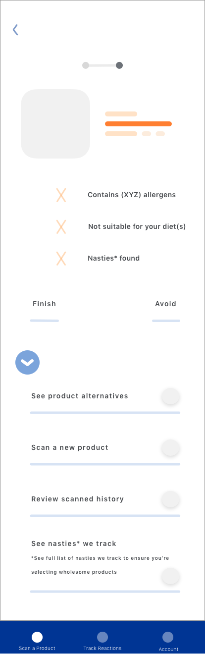
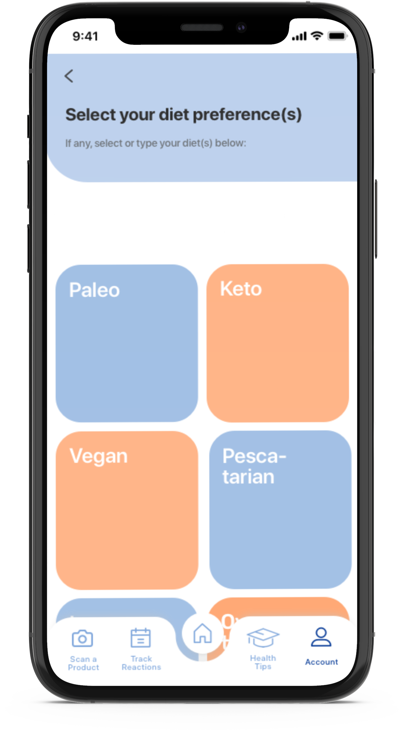
Initial sketches (select screens)


Low-fidelity wireframes (select screens)


Style guide
High-fidelity screens (select screens)


Invision link to prototype: https://invis.io/CDXISROBR7H
Usability testing
After the app prototype was complete, I was ready to recruit participants for usability testing. I conducted two usability tests with a total of nine participants. User testing covered all features of the app with participants--scanning a product, tracking reactions, health tips, nasties list and profile creation.
Script and questions for testing:
https://docs.google.com/document/d/1q8e_BWhWN047GpMFYoAb6YXmN1W8dQBpFp1owPIa9Ss/edit?usp=sharing
Key quotes from usability tests:
“[The app] makes me feel like I have to be more cognizant of what I’m eating otherwise if I ignore my allergy, I’d have to report it using the app... the app would hold me accountable in a positive way”
- J. Kang
“[It’d be beneficial if there was] a simple ‘avoid list’ and ‘sensitive list’, so people can quickly access and see bullets of ingredients they need to avoid or ingredients that they need to eat sparingly as these might cause reactions and become worse like an allergen”
- C. Lao
The solution
Deploying a human-centered design method throughout the app’s development, the app functions as a supportive resource adapting to users’ health and dietary needs, and delivers an aesthetically-pleasing and delightful user experience through:
Scanning foods to ensure they’re allergy-free and diet-friendly
Keeping record of food reactions
Recommending course-correcting eating habits to minimize and even prevent further reactions
Providing monthly reports with deeper analyses on recorded reactions and potential sensitivities to be aware of
Providing nutritional tips, recipes and more, according to user health needs
Conclusion
Next steps
Deeper research and honing of proposition
Further research with participants
Further research with retailers
Develop designs and a prototype for Smart Watch tech
Consider making designs and a prototype for Apple Glasses (latest rumor) /Google Glass (if this makes a comeback)
Continue interviewing users (monthly basis) to find out more of their health needs, experience and usability while using the app
Continue incorporating notifications and modules in the app that educate the user about their health and food choices and share nutritional advice specific to their needs
Reflections
With a personal interest in health and well-being, this was a passion project for me as I worked directly with people to understand their health needs and develop a resource that educates and course-corrects users to make healthy and allergy-free eating choices to prevent reactions (i.e. food sensitivities or allergic reactions).
Sharpening the MVP:
In the beginning stages of my project, I was closely focused on the Scan a Product feature although where the app is strongest in its selling point--course-correcting and educating users of their eating habits through the Track Reactions feature--wasn’t discussed enough in my MVP. A few calls with my UX mentor led me to reshape the MVP to better illustrate the app concept.
Iterating efficiently to accommodate the most essential user feedback:
After conducting my first round of usability tests of my iOS prototype, I gathered great user feedback and wanted to iterate the prototype addressing all feedback. Due to time constraints, I addressed all critical and major issues and at least a few minor issues that incorporated feedback users would receive after building a profile.
Choosing excellence over perfectionism:
When it came time to design my low- and high-fidelity wireframes, I battled with perfectionism. I desired to have the wireframes developed as I envisioned, while my perfectionistic tendencies occasionally prolonged my decision-making between visual elements and ensuring all user flows were a pleasing experience to users. I overcame this after connecting with a few personal contacts who also deal with perfectionism and wrote out a personal action plan of what needed to be done with excellent standards (not perfectionism) and at a reasonable amount of time.